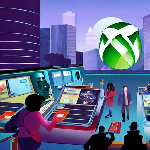
Xbox has unveiled its new logo, one that harks back to the 2000s while confidently stepping forward. The design, reminiscent of the classic 3D sphere with an 'X' inside, is a testament to the brand’s evolution without losing its iconic essence.
Early Xbox enthusiasts are thrilled by this nod to nostalgia. They point out that the original dashboard already possessed a glossy, fluid aesthetic years ago, much like the new logo's smoothness combined with the sharp clarity of more recent designs. The return to 'Frutiger Aero' adds a touch of retro charm.
Interestingly, comparisons have been drawn to Apple’s Liquid Glass design due to its glowy appearance. However, original Xbox fans are quick to defend it, highlighting the blend of past and present elements that define this new logo. It feels like taking the best parts of different eras—smoothness from the 360 era, sharpness from XB1/Series, and the OG-era radiation green glow—and merging them into one cohesive design.
For those interested in more gaming news, Creative Bloq offers insights on how a game artist uses emotion and dance to create haunting creature designs or examines the stark differences between Assassin’s Creed Black Flag Resynced versus the original version. Stay tuned for updates!