Inca Kola, once the undisputed king of Peruvian fizzy drinks, has undergone a rebrand that has left some loyal customers feeling uneasy. While the new design is more minimalist and modern, it has sparked debate about the balance between tradition and innovation.
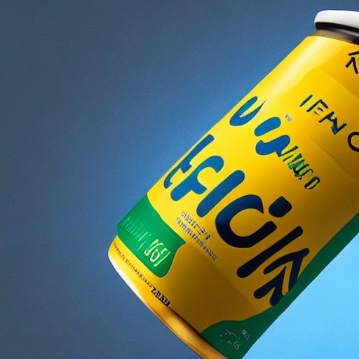
The rebranding, led by the design agency Epoch, stripped away the white borders, the shape of Peru, and the 'since 1935' legend from the logo. Critics argue that these elements were key to Inca Kola's national identity, while supporters see the change as a necessary step towards global appeal.
The new logo, while simpler and more readable, has been criticized for appearing 'bland' and 'gringo'. One customer suggested, 'They might as well put a gringo flag on it.' This controversy highlights the tension between maintaining historical significance and adapting to modern tastes.
Despite the backlash, the rebranding effort includes a unique sonic logo created with Echoic Audio, using the sound of traditional glass cola bottles. The agency aims to modernize the brand's identity while emphasizing its role in bringing people together at social gatherings and meals.
As Inca Kola faces increasing competition from rivals like Pepsi's Triple Kola, this rebranding is seen as a strategic move to stay relevant. However, the question remains: does removing historical elements risk diluting the brand's cultural significance?