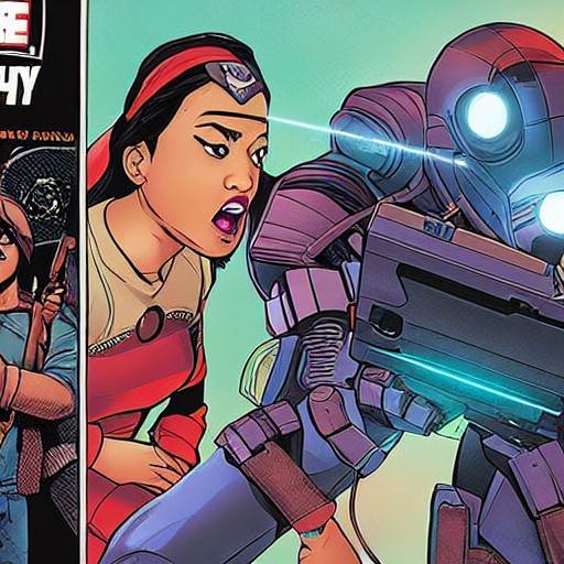
Partha Pratim Sarkar takes us through the intricate process of crafting a compelling comic cover, from initial sketches to final inking. Each decision serves a purpose, guiding the reader into the heart of the story. A cover is more than just ink and paper; it's a gateway to a world where every line tells a part of the narrative.
The Corpse Knight cover, with its tight schedule and clear brief, serves as a masterclass in efficient storytelling. The use of composition, exaggeration, and spot blacks ensures that the cover not only grabs attention but also whispers the essence of the story. From the initial idea to the final clean-up, every step is deliberate and purposeful.
Partha’s background in animation shines through in his approach, where the silhouette is always the first consideration. He pushes the proportions and gestures to enhance clarity and readability while maintaining the characters' distinct personalities. The addition of textures and details completes the picture, setting the stage for the impending adventure.
The article is a reminder that in the world of comic covers, every line and shape has a reason. Whether you’re a fan or a future artist, this guide offers insights into the craft that can turn a simple image into a powerful invitation.