The 'dejoying' of McDonald's has lost me as a customer, and I'm not alone. Walking into a Toy Box Diner in Saitama, Japan, one is greeted by walls adorned with vintage fast food memorabilia—trays, posters, cups, and toys from the golden era of Americana.
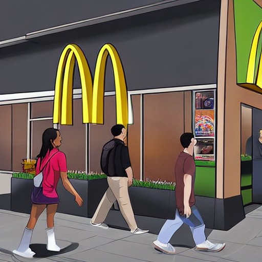
However, this joyride through nostalgia contrasts sharply with today's McDonald's, where primary colours and expressive characters have been replaced by monochrome surfaces and steel fixtures. The new aesthetic is a deliberate choice to strip out personality, reduce maintenance costs, and signal an aspirational blandness.
The change began in the early 2000s as McDonald's sought to appeal to an adult demographic, competing with coffee chains like Starbucks. Ronald McDonald was quietly retired, and themed seating and playgrounds vanished. Today’s McDonald's feels like a transit zone, not a place for celebration or excitement.
This McDonald's story is part of a broader flattening: a corporate preference for inoffensive designs over the distinct and human. It's the same logic that makes every high street look identical and every app feel interchangeable. The result is a brand that has lost its distinctive charm, prompting questions about the value of neutrality versus sophistication.