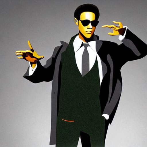
Is the original Matrix poster really as bad as the director thinks? Lilly Wachowski, co-creator of the series, is unimpressed, describing it as early 'AI slop'. The DVD cover for The Matrix doesn't make sense: Morpheus’ shoulder is above Neo’s but his hand looks longer than Neo's. And the guns! They're just not interesting.
While the poster failed to convey the essence of the film, it remains one of the most iconic in movie history. For many, its design was never questioned, even as a child. However, it is far from perfect – a mere representation of the standard floating head drivel that has plagued action films for decades.
Interestingly, the original poster's flaws are dwarfed by those of The Matrix: Reloaded's DVD cover, which was terrible even to the discerning eyes of a child. Perhaps it’s time to reflect on our aesthetics and how they evolve over time.