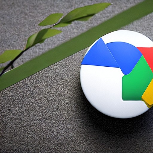
In late 2025, Google began rolling out new icons with a gradient design. Now it seems these updated visuals are making their way to more of the company’s applications.
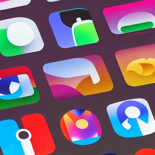
The fresh look eschews the uniform circle design that once tried to squeeze every shade of the Google logo into one spot. The new icons are softer and more varied, featuring rounder corners and gradients that gently transition from almost pastel shades into the more saturated primary colors associated with the brand.
This change reflects a broader trend in design that has moved away from the flat aesthetics of the late 2010s and early 2020s. Google Sheets, Slides, Forms, Sites, and Keep all ditch the traditional portrait-oriented sheet of paper look, shifting to landscape layouts which better suit modern usage.
Most icons are an improvement, offering a greater visual distinctiveness and often embracing a single color for a more cohesive feel—like Chat, which trades its four-color speech bubble outline for a cheerful green blob that echoes the Google Hangouts icon. The one exception is Keep, where personal opinion holds, it looks decidedly less appealing.
It’s unclear when this new look will roll out to all users, but expect it sooner rather than later.